Web Designers who have been in the field for a long time don’t make common web design errors. If you are an expert web designer, there is little chance that you’d pepper the web page with mismatching fonts or hide the search bar at the bottom of the page. Experience has taught you to make your website compatible with browsers you hate, because there are millions of people out there who are still using them. You don’t (at least I hope you don’t) design websites that start playing videos or pumping music automatically, nor do you startle unsuspecting visitors with enthusiastic pop-ups.
That’s what I told myself when I patted myself on the back. I felt that I was too smart and wise to make any errors that could negativity affect website usability. One fine day, a friend of mine pointed our three subtle usability errors in a website I had designed. Shocked at what I had missed, I looked for more and realized that many of us tend to make several usability mistakes without even being aware of them. Here are some of the most common usability errors that even experienced designers end up making, once in a while.
1. Web Forms that Annoy
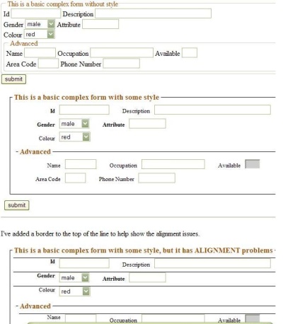
Filling forms is a chore that none of us like. A decade ago, users had to fill out a long form even to register for an email address. Modern users expect you to design short forms that can be filled easily and quickly. There are a number of things that you need to get right. Don’t make the users fill too many mandatory fields, offer hints when there is the slightest chance of the users getting puzzled over the information they need to enter, use password masking in a way that makes it easier for mobile users to see their inputs.
Designers are not unaware of the techniques for creating usable web forms, but many of us don’t do enough to validate our forms. But the biggest mistake that many of us end up making is creating amnesiac web forms that forget all the information entered by the user once the user leaves the page. Imagine a mobile user entering information, clicking ‘Done,’ and then getting back on the same page – which now has freshly empty fields — with an error message. He is not coming back and filling up the whole thing again unless he really has to.
Just imagine filling forms which requires tons and tons of information. It acts as a deterrent and scares users away. Gone are the primitive days of long forms. Remember, forms are not just accessed on desktop, but also on mobile devices. It is almost impracticable to fill such long forms on mobile devices. Don’t forget customer is always on the go.
2. Hiding Help Pages
One of the downsides of being an expert designer is that you can never really understand the problems faced by people who have not have the knowledge of web design and navigational conventions. What may seem obvious to you may be imponderable for someone who doesn’t instinctively ‘get’ technology. It is your job to create a highly usable website that can be browsed intuitively. If the user doesn’t ever need to click on any help-related page, you have done an awesome job.
However, when the users are lost on a website or cannot find important information, they head towards help pages like FAQs, Site Navigation, Support, Help, etc. A well-designed search button may negate the need for such pages, but every website doesn’t have one. As a designer, you must empathize with the visitors and create clearly visible help sections. If the website you are creating caters to people who are new to the web, or if it offers services, products or information that are complicated, you must place the ‘Help’ buttons right where the users need them.
Let us take the case of Samsung. It has a distinct “Get Support” Section and search option which effectively guides users in case of problem.

3. Blank Slate that Says Nothing
Certain web portals and web applications depend on data from users – only after the user has entered certain data does the app or web page fire up. The most common examples of a blank slate would be pages for websites like Twitter and Stumble Upon that ask the users to select certain interest and use the inputs to populate the page according the the information entered. It is quite likely that you can work as a designer for years and never come across a project that requires a blank slate.

It’s perhaps a little quirky of me, but I see some similarities between blank slates and 404 error pages. On both pages, the natural state of the page is blank, or almost blank. Usually, while designing a page, we have to find a way to cram a lot of information gracefully on one page. The blank slate looks like a holiday and we don’t work hard on it – just as we do not do much stuff to place on the 404 error pages. But there is a way of making error pages creative, and you must find a way to make the blank slate of your site or app appealing to the users.
While designing a page with blank slate, the least you should do is say what is not there on the page, “No new messages from your friends” or “No new posts found,” and suggest actions to users. You can also use your creativity to add other elements or links to solutions and answers that can be useful to someone viewing the page for the first time. A little block of text explaining the purpose of the page can also be adequate in some cases.
Wrapping up
The devil is in the details. By keeping in mind the above points, you can sidestep slippery usability errors that can result in a bad experience for the users. The best things about these three subtle errors – or oversights – is that you simply need to keep them in your mind while designing. Once you have these concerns in your mind, you need to move mountains to put things right.
Author Bio:
Sebastian Atwell works for PerceptiveWebDesign, a custom web design and development company in Los Angeles which provides custom web application development services for small businesses. He has worked on several freelance web design projects and believes that a well-drafted contract is a good foundation for a healthy designer-client relationship.

Nicky Helmkamp says
Hey Albert, we featured you in our Monthly Resource Round up! http://www.wiredtree.com/blog/monthly-round-up-septembers-best-web-designdevelopment-cms-security-content/