
Marijuana logo design plays a vital role in weed’s emerging respectability as America’s relationship with marijuana is changing. Marijuana businesses have never felt the necessity of having professional branding before. The green cannabis leaf has always been the default logo. But things have changed recently.
Half of the U.S legalized weed for medical and recreational use. Therefore, professional branding for marijuana business is in higher demand now due to the growing popularity in the cannabis industry. Also, having a custom cannabis logo has become crucial in the marijuana business.
An estimation of Marijuana Business Daily shows that U.S. retail sales of legal cannabis products totaled $6.1 billion in 2017, which could ascend to $13.7 billion by 2021. It’s quite an impressive amount of money to be made on legal marijuana.
Cannabis Logo Design
The common cannabis logo we see is usually the symbol of a 5-7 pointed green marijuana leaf. This logo represents the company and their business motives. Of course, the symbol is pretty identifiable, but this means your brand is also similar to hundreds of other cannabis brands.
In short, your company will most likely not going to be recognized by many if you use a cliché-looking cannabis leaf in a literal shade of green. It’s hard to look like a popular brand when you don’t have a unique business logo. If you’re using a logo based on current trends, then it won’t be memorable due to the lack of uniqueness.
Many new cannabis brands are still using leaf symbols as their business logos but in a different way. You should reconsider changing the logo of your cannabis brand if you want your brand to stand out from the other companies. But how would you do it? Of course, you may or may not have any expertise in the logo-designing background. But that’s what professionals are for.
For instance, if you want to have the perfect design for your business site, there are some professional tips you can follow to build and design your business for success, or if you want to make a paper work but you don’t have enough time or information to finish it, there are many cheap writing services online that can provide you professional help. Similar to that, there are various top-rated logo design services where you can hire professionals to design the unique logo for your marijuana business.
Cannabis Business Branding
Cannabis-based markets are emerging, especially those within the healthcare and leisure markets. You can create a number of different businesses around marijuana, and they need to have a stronghold of their branding like any other business. Public image is important for business success.
There are many types of cannabis businesses, such as cannabis cultivation, cannabis accessories, cannabis dispensaries, cannabis apparel, concentrate companies, edible companies, etc. Many are hiring top-rated design agencies and freelancers to create their brand identities for all kinds of cannabis products.
However, branding a cannabis-based business can be complicated due to the social stigma associated with marijuana. But many major companies are still killing it in the market with their unique business strategies and logos. Here are some examples of good cannabis logos.
Bloom Farms
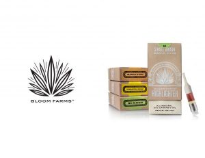
Cannabis Logo: Bloom farm has an abstract, line-drawn cannabis leaf in the company logo that looks very attractive. It’s not very common to see a logo bigger than a brand name, but the logo looks quite balanced and perfectly shaped because of the symbol having the same width as the brand name. The name is also in all capital letters and has the same height, resulting in a very clean and flexible layout.
Product Packaging: Bloom Farms provide slim and elegant boxes that come with a metallic finish logo and luxurious elements. The brand packaging is very different comparing to other medical marijuana brands. It looks like high-quality materials and very luxurious while also being “raw” and approachable. They use a different color for each flavor, such as the orange color for mango, the yellow color for pineapple, etc. It makes the variety in products very eye-catching to customers. The label has all the information you need to know about the product while still rocking that appealing look.
Kiva
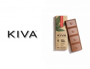 Cannabis Logo: Kiva has an all-caps wordmark logo that gives the products associated with the brand a rather serious feel than regular candy. The brand doesn’t have any leaf symbol in their logo. There’s a hand-drawn leaf that appears on the brand’s packaging and chocolate. While some people might assume that the concept of having a simple logo design is not good for business, Kiva proves that simplicity is exactly what you want to stand out sometimes.
Product Packaging: Kiva has an organic, vintage style packaging that captures its classy “connoisseur” position in the cannabis industry. The layout of product information is also very straightforward. The package displays the amount of THC (Tetrahydrocannabinol) the product has in it, which is something most customers wish to know. There’s a warning at the bottom that stands out without interfering other relevant information. Kiva’s natural looking packaging gives it a healthy and trustworthy vibe.
Hashed


Cannabis Logo: Hashed has a very simple, fresh-looking, and clean leaf symbol. It doesn’t look anything like the other leaf logos mentioned in this article. It comes with an all-caps wordmark that looks modern and a weighted layout that makes it eye-catching to customers. You can tell that it’s a leaf-inspired sybol that is both scalable and unified.
Product Packaging: The design label has to be good and unique in the cannabis industry as it displays your brand and products as well as the details like characteristics, size, and strain. Hashed uses an attractive sans-serif font that matches the logo. As a result, all the information look legible, and you get a clear visual hierarchy of elements that are relevant. Hashed uses a similar design for all of its products while the strain color is different for each type. This makes it easier for consumers to choose cannabis types and potencies.
Marley Natural
Cannabis Logo: Marley Natural’s logo has three elements, such as wordmark, symbol, and monogram. This allows the logo to be used in both flat and upright arrangements, meaning the use of it will be flexible on different platforms and packages. The design of Marley Natural’s logo is in black & white, accompanied by three-colored dots that represent Rasta Culture and Bob Marley. The wordmark symbolizes the legend of Bob Marley with the hand-drawn symbol of a lion and an artificial monogram.
Product Packaging: Marley Natural sells body products that are cannabis-infused, such as lip balm, body lotion, soap, etc. However, it falls into a lifestyle category and has a packaging that follows suit which makes it look high-end and natural. It stacks perfectly on different package sizes and stands out with its three colored dots design.
The Canna Farmacy

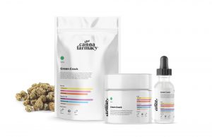
Cannabis Logo: The Canna Farmacy has a simple yet elegant logo. The brand name is long, so the designer had to stack it in a tight lockup and slant the word “the” to make it noticeable. They really did a great job with the logo despite having a long brand name. The typeface is unique yet scalable and readable with curves and slants that make the brand appear to be expensive, high-end, and attractive.
Product Packaging: The Canna Farmacy uses an all-white packaging that looks clean and consistent. It allows the colored bars that specify the medicinal properties of the strains of cannabis. Each of the labels contains a good amount of text, and the name of the products are easy to spot. They use a different colored dot for each strain and a clever iconography that communicates the different flavors in products.
Kola
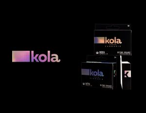 Cannabis Logo: Kola has a short, simple, and easy-to-remember brand name which is really good for business popularity. Kola’s logo is simple and has a tail on the letter “a” which references a marijuana leaf. The lowercase wordmark makes it look attractive and approachable. The straightforwardness of the lowercase wordmark and square symbol give it an attractive look in a metallic gradient. There’s a block to the left of the logo that makes you look into the logo from left to right and guides your eye to the start of the logo. This is a really clever design for a cannabis logo.
Product Packaging: The packaging comes in a black design, following a holographic foil that looks both clever and modern. It’s referencing the ecstasy and trippy feeling of cannabis subtly. As the light hits the foil, the logo keeps shaping into a different form of color. This makes the brand name more memorable and recognizable without having a traditional “brand” color. Kola’s design is exciting and modern, giving it a very premium brand vibe.
Tokyo Smoke
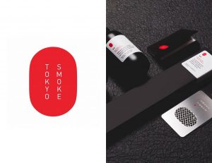 Cannabis Logo: Tokyo Smoke’s logo has the squared-off oval shape and is vertically arranged, making it stand out from the other brand logos and also look great on signs, posters, and products. The typeface is hard to scale because it’s thin, but the bold red symbol with the wordmark to the right of it looks good. Tokyo Smoke’s brand identity looks sleek, modern and high-end, and the logo fits perfectly with the brand.
Product Packaging: The packaging of this brand is quite different than other cannabis products. It uses a matte black packaging that makes it look luxurious while still being approachable. The label text is designed in both red and black which makes the brand easy to spot.
Conclusion
A lot of cannabis growers are making a legitimate business out of the growing process. Therefore, many investors are investing in cannabis-related businesses. Cannabis logos should be different than being just another representation of marijuana leaf. It would be best to hire a professional designer to create a brand identity system.
But why is this necessary? Because any business is incomplete without its strategy and design. The most important thing for companies is that cannabis branding design must reflect their mission and vision. Creating a great cannabis logo means a lot more than picking a 7-pointed green marijuana leaf and slapping it over the brand name. We hope this article inspired you with some of the best cannabis branding designs.

Hello, I would be glad if you share your thoughts about my article.
Best, Tiffany 😉
Thanks for the love Tiffany – we’ve written about this topic a few times as well. It’s great to see cannabis companies taking their brand identity seriously. To be able to confidently step to an investor with a brand that is well represented across design, voice, tone, personality etc. It makes the world of a difference.