The lion is one of the most popular images used in company logos, since this animal has strength, power and courage. He is a born leader, instills fear and commands respect. A lion is protective of his cubs, pride, and territory. These are qualities that any company would desire and hope to portray to their customers and competitors. Pictures speak a thousand words and the companies can make a strong visual impact by incorporating a lion into their logo. Here are 20 of the best lion logos used currently, with an explanation of the inspiration behind their design.
1. MGM Studios
The famous “Leo the Lion” logo of the MGM Studios has a lion’s head in natural colors and its paws resting on a ring of golden film ribbon that beautifully indicates the cinematic industry. The lion represents the core attributes of the company; its nobility, strength and corporate power. Its aggressive supremacy is marked by the lion’s roaring expression.
2. MGM Grand
This elegant, poised lion on the prowl symbolizes MGM Grand, the “City of Entertainment”, while the name written underneath in bold and all-caps indicates the dominance of the company. Their first logo was borrowed from a 1968 stylized version of MGM’s Studios logo of a lion head, which then gradually evolved into this muscular full-body lion.
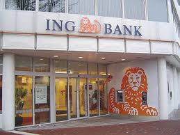
3. ING Banking
The orange color that Dutch bank ING uses in their logo represents their country, being the national color of the Netherlands. Moreover, this animal is their national symbol. The lion does not have a wild mane; it sits calm and composed with its long tail up in the air which is perfect to inspire confidence and tranquility, yet strength to a banking intuition.
4. Postbank
This bank operates under the ING Group and its previous logo was the same as the ING lion, but in blue. It is now modified into the lion’s head only, telling customers that this is a financial institution they can trust. The lion has been retained to reflect power and leadership of the bank.
This very effective logo uses a golden lion’s head turned to the right, indicating the bank’s dominance and authority. The lion holds a globe to reflect its increasing global presence. This logo is set on a blue background with the letters “RBC” written below in white. The simple lines of the drawing and the contrasting yet complementing colors add to its visual appeal.

6. Peugeot
The posture of this “Blue Brand” lion is inspired from the Coat of Arms of Franche-Comte, where the founding Peugeot family hailed. Though the design of the lion emblem has evolved over time, it continues to reflect the high quality and strength of this brand. It uses silver to represent the steel body of the cars, accentuated by shadows to bring about a bi-metallic lustrous and matte effect. The front paws in the air stand for power and balance, while its piercing eyes represent the long-term vision of the company.
7. Holden
This logo is based on a fable that a lion rolling a stone brought about the invention of the wheel. It is iconic of Holden, the Australian branch of General Motors car manufacturer. The symbol has a white lion with his paw on a round stone inside a red circle; only the front half of the body is visible, thereby bringing the stone into focus. It is such a catchy logo that Holden is now nicknamed the “Red Lion.”
8. Saab
The logo of this airplane and car manufacturer uses a part-lion, part-eagle mythological creature called a griffin, which is the emblem of Scania in Sweden where Saab vehicles originated. While the lion symbolizes strength, the eagle is a representation of the company’s vigilance. The combination of the two is meant to represent the high quality of Saab products both on land and air.
9. Lowenbrau
This logo has been inspired by a 17th-century fresco in the original brewery in Germany, depicting Daniel in the lion’s den. In fact, the name Lowenbrau translates to lion’s brew. This logo depicts the courage, dignity and leadership that the company has shown. It uses a memorable color combination of the golden lion on a dark blue background with light blue label.
10. Detroit Lions
This blue lion symbolizes the dominance of the oldest team in the National Football League (NFL). The lion logo has undergone several modifications and modernizations; this latest version has an aggressive stance with its forepaws in the air. It has detailing in a white and black outline to represent the renewed vigor of the team.
11. Premier League
The lion wearing a crown, with its right paw placed on a football, creates a strong pictorial representation of the Premier League that consists of clubs of the English Football Association. It is a logo of confidence and elegance. The lion’s ferocious look reflects the authority of the League. The logo uses bright red and blue because of its lively, action-packed games. The lettering of the name has been changed to uppercase due to its rising international importance.
The logo has been inspired by the civic coat of arms of Earl Cadogan, the first president of the club. The format of the logo was modified several times, but the original blue lion was reinstated in time for the centenary celebrations in 2005 to uphold tradition. The lion holds a staff of the Abbot of Westminster who presides over Chelsea; the roses represent England and the footballs represent the game. The entire logo is meant to symbolize the club looking forward to an exciting, new era of football.
13. Aston Villa
The gold lion stands facing the left, with its front paws in the air and a light blue background. Aston Villa Football Club is abridged to “AVFC” above the lion and the club’s motto “Prepared” is written at the bottom. One white star above the lion’s paw stands for their 1982 victory of the European Cup.
14. KNVB (Koninkhaving lijke Nederlandse Voetbal Bond)
This is yet another football club having a lion in its logo. The name KNVB translates to Royal Dutch Soccer Association, which explains the crown that the lion is wearing. This is the national football team of the Netherlands, so it uses the national color orange in its logo. The current stylized form of the lion’s head has evolved away from its close resemblance to the Dutch royal emblem.
15. PLNU Sea Lions
The sports program of the Point Loma Nazarene University in San Diego is called Sea Lions. The green lion riding on a wave incorporates the Pacific, where the university campus is located. The school’s sports teams cherish the qualities of a lion; leadership, strength and athletic energy on the sports field at inter-school events.
16. Cannes Lions
Cannes Lions International Festival of Creativity is the biggest and most prestigious awards festival for the advertising and creative communications community. The lion is modeled after the Lion of St. Mark’s Square in Venice, where the first festival was held. The bold, black lines of the lion’s head, mane and front paw clearly typify creative excellence.
17. RICS (Royal Institute of Chartered Surveyors)
The face of the lion is outlined in striking blue on a white background within a circle. The lion wears a crown to reflect the royal connection of the company. It faces right with a fiercely competitive look and focus in its eyes, intimidating its competitors.
18. Queen
The logo of the music band called Queen has two lions facing each other, to represent the zodiac signs of two of the band members. These lions are holding onto a stylized letter “Q” to represent the name of the band, with flames rising above it. The logo bears a distant resemblance to the Coat of Arms of the U.K.
19. Cunard
The Cunard cruise liner company has borrowed the Golden Lion from the Scottish flag. It is designed to surround the lion with fern leaves, as a symbol of gratitude to the builders of their first ship and to the people of Scotland who helped them raise the capital. The lion wears a crown for the royal connection and holds a globe, for its international travel aspect. The entire logo is in gold and looks elegant and stylish, just like the cruise liners.
20. Lonsdale
This is the logo for a boxing gear manufacturer, and rightly has an active, passionate and aggressive lion. The “L” of Lonsdale extends underneath the entire brand name, indicative of the dependability and durability of the company’s products. Lonsdale has branched out into clothing, and the iconic lion logo is prominently displayed on its jerseys and tee-shirts.
Each of these best lion logos is effective in its simplicity and choice of color. They have come to be strongly associated with their brand name. They have extended authority to the company in its respective industry, inducing competitors to watch out for them, viewers to take notice of them and employees / associates to be proud of them.
Tesla Nikola says
What? No Lion King?
Ha ha, pretty funny, but not really a logo, and considering Simba and Nala were actually half-brother and sister being that only the pride alpha male fathers offspring….
Danial Munsif says
good collection premiere league logo is my favorite <3
ndop says
Thanks for inspiring me to my own logo..
Nancy Clark says
Beautiful! I enjoyed my time spent on your lovely blog.
Andy says
I wonder why some of the Lion Logos has long tongues? What’s the meaning of it?
Steyn says
Really cool! Looking forward to see a compilation of best tiger, monkeys, elephant, etcetera designs. Keep up the good work guys!
James says
Texas A&M Commerce has the largest logo in the world.
Rita says
What about Lions Clubs International logo? It’s the largest service organization in the world!