Single image logos help convey a company’s mission with a simple, but creative design. These logos are direct and to the point. The best marketing tactics are usually made of those same qualities. Creativity and imagination help single letter and single image logos relate potential clients to the brand. The following is a list of some of the most creative single image or letter logos in the market.
1) Modini Italian Shoes
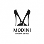
Modini Italian Shoes uses their logo as a way to demonstrate their product. This single logo features two black heels facing each other to make the letter “M.” The logo is classic, but creative in the way it gets its point across. As a fashion company, Modini needed to separate themselves from their competition. They accomplish this by incorporating their product, fine Italian shoes, into their logo design.
2) Hannover Zoo
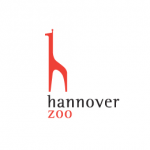
The Hannover Zoo logo is imaginative and whimsical. It features a one dimensional red giraffe facing left. Its legs and neck are positioned so that the animal creates a lower case “h.” Its simplicity is fabulous because it conveys Hannover Zoo’s affiliation with animals. This is a very creative logo thanks to the zoo’s decision to incorporate an exotic animal into their image based single logo.
3) French Bakery
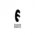
French Bakery’s logo is a script logo. However, at first glance it may not look like it. The logo features what looks like the black silhouette of a baguette. If you look closer, you realize that it is more than just a baguette because it is the letter “F” too! This logo is ingenious because it combines the epitome of French baking, the baguette, with the company’s name. This is an the ideal combination of single image and script letter logo design.
4) Diet Care Nutrition Experts

Diet Care uses its logo to convey its specialized services. The logo features a black letter “D” being squeezed by a yellow tape measure into a curvy silhouette. The logo provides a clear and obvious explanation as to what the company offers – expert diet care. Clients can expect to slim down thanks to the hourglass figure seen on the “D.” This creative logo uses the company’s initial as a way to explain its mission in an imaginative way.
5) Bee
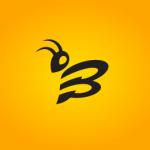
Bee uses its logo as a play on words with both design and symbolism. The logo features a black Bee on a yellow background. Its head is curved to the left, and its wings are extended out to make up the letter “B.” Thus, the logo symbolizes both the letter and the insect. This mixed script and image example is a marvelous example of the single logos category.
6) Antarctica

Antarctica features an adorable logo of an “A” disguised as a penguin. The bird is native to Antarctica; thus, it makes sense for the company to capitalize on the continent’s cutest animal. The logo features the outline of a small penguin with a rounded stomach and curved wings. The outlined body of the bird makes up the lower case “a” of Antarctica. This is a very clever logo because it uses an animal’s body to convey the company’s initial.
7) Abird
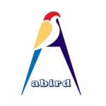 Abird also uses the very popular animal/ letter logo concept. Its design features the outline of a very colorful bird that resembles a parrot. The bird itself is made up of three parts including a red head, yellow wings, and a long slanted blue tail. The bird faces to the right, and its tail makes up the bottom portion of the capital “A.” The other side of the letter is navy blue. It contrasts against the bird to make its stomach and the other half of the A. This logo is creative because it uses “a bird” to make up its logo. It is a very literal, but colorful idea for a single image animal turned letter logo.
8) McFarland Property

McFarland Property’s logo is very creative in the design and overall message. It features a red square with the letter “M” in the middle. However, this is no ordinary “M.” It is designed with straight lines to create a castle. The “M”” has two medieval like towers on each end with a flat top between them. The humps of the “M” are made to look like the rounded doors of a castle. If a potential client looks at this, they might think that McFarland Property only deals with the best properties – perhaps even a castle.
9) Forestal
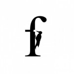
There may be an abundance of animal image logos, but they get the point across. Forestal’s logo is a black lower case “F” with a woodpecker pecking out the hash. The design is simple, and the bird refers back to the company’s namesake – the forest. A great example of a script single logo that encompasses two design elements into a single easy to understand logo, anyone can enjoy.
10) Utensil Labs
 Utensil’s logo features a “U” in the shape of a graduated beaker. It has measurement marks and bubbles coming out of it. The concept of the logo is creative because it uses a common lab tool in the design of the initial.
In conclusion, single image and letter logos offer some of the most creative designs in the marketing world. They provide a clear idea of a company’s mission in a unique package. Thanks to logo creativity, brands become more recognizable when they utilize singular focus logos. These logos are direct and to the point. Having a simplistic yet unique logo that can be identified on billboards, commercials, or even custom boxes for retail is crucial to branding.
Hilton Guzman says
This article is an inspiration. You are a profound and insightful writer that knows how to get your point across with interesting and quality content. You are wonderful with words.