Flat is fabulous! There is no denying that flat design is a major trend. You see it online, on your desktop, and maybe even on the home screen of your smartphone. To understand exactly what flat design is, read on to find out about its four core elements.
1. Extra Effects are Gone
The foo-foo has flown the coop. In flat design, icons lack the little details that make them mimic items in the real world. There are no gradients, textures, or shadows. The look is strictly two-dimensional. The idea is that users do not need the extra effects to know what the purpose of an icon is.
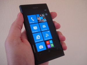
This approach works especially well for small mobile devices, since it helps simplify the user interface for a more efficient experience. Windows phones, such as the Nokia Lumia 810 on T-Mobile, feature flat design. The live tiles make for a customizable, organized home screen.
2. The Shapes are Simple
A lot of rectangles and squares pop up in flat design, though you’ll also see circles, triangles, rhombuses, etc. Basically, if you learned the name of a shape before you reached high school, it fits in with flat design.
That isn’t to say other shapes have no place in flat design, but they have less of a place than they do in more traditional designs. The edges can be either sharp or slightly curved, but those edges are always clean.
The simple geometric shapes contribute to the efficiency of flat design. They are also easy to tap on with a finger, which is another reason flat design lends itself so well to the touchscreen world.
To see an example of this simplicity, go to etchapps.com.
3. The Fonts are Not Frilly
In flat design, the text goes hand in hand with the simple shapes. Since a fancy typeface would look silly with a minimalist background, the preferred typeface in flat design is easy to read. The wording is to the point and does not lean on flowery language to relay a message. Sometimes designers throw in a dash of surprise by making limited use of a fancier font.
Go to spelltower.com to see an example of flat design that incorporates simple font, basic shapes, and lovely colors.
4. The Colors are Bold
Photos are often used in flat design to fill the simple shapes mentioned above. When a tile or icon does not feature a photo, however, color is what makes it pop out. For example, in the spelltower example above, a more neutral color palette would entirely snatch away the site’s visual appeal.
Bright colors — and a variety of them — are often used in flat design. In fact, where typical color palettes feature just two or three colors, flat design often employs up to eight at a time.
A National Geographic app uses a dark background, white text, and yellow highlights. The app is also an excellent example of the appearance of photos in flat design. Go to designmodo.com to take a look.
There is no telling how long the flat design trend will last, but its clean lines and modern look are for now the go-to for many designers and users. How do you like it?
Author Bio: Calvin Sellers is a freelance writer and graphic designer from Tampa, FL. Follow him on Twitter @CalvinTheScribe
