Typography has been around for years. Off lately, it’s bloomed into more of a trend as business owners wish to have their presence felt in the hearts and minds of its users. Typography has many forms , web designers must experiment and apply these forms to leverage the full potential of written and visual information.
Typography connects with users at various levels. Good fonts are not the ones which are bold or full of colors, but ones, which enhance the overall appeal of the website. Here’s a list of 20 beautiful websites that use the power of typography to make a difference:
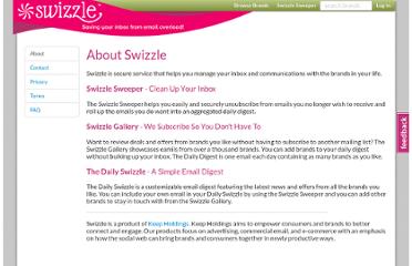
#1 – Swizzle
I admire the way this site shows so much content without compromising its typographic aesthetics. Included in the top 50 websites of 2013 swizzle draws on the charm and magnetism of its own.
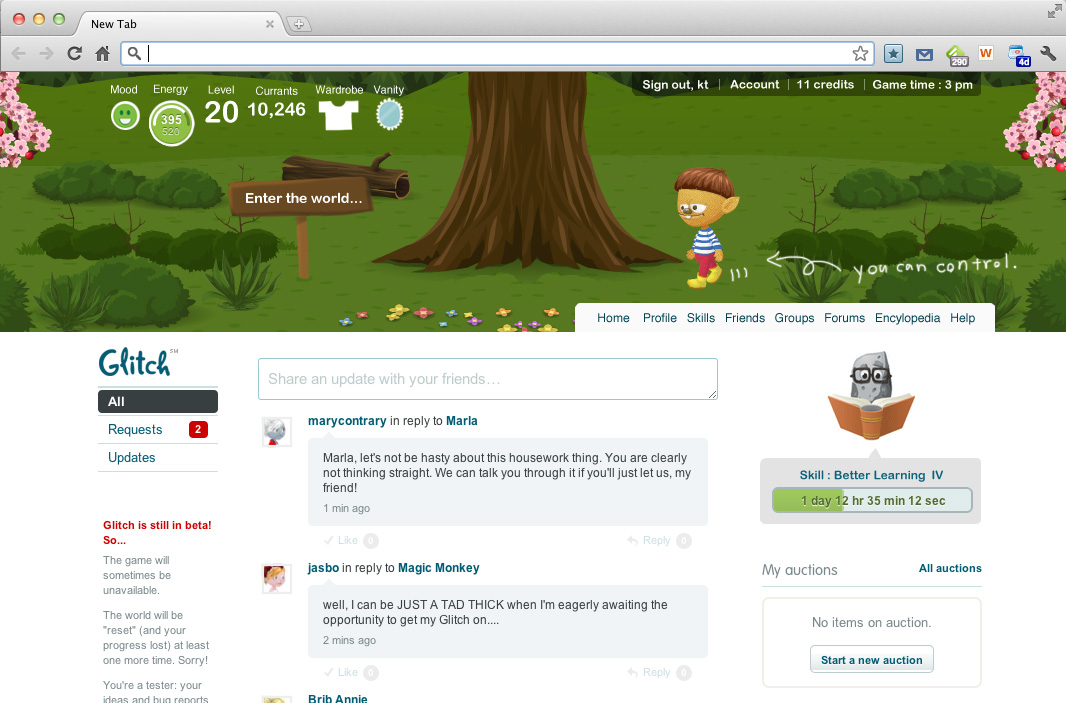
#2 – Glitch
A great example of simplistic typography. The fonts readily invites one to explore the adventure ‘with friends’. In my opinion, a perfect game website which means business with nothing confusing about it.
#3 – Life & Thyme
Illustrative typography making for an easy read helps the business to demonstrate its own purpose. Though the images form the backbone of the site they do not overpower the written text – this quality of the site makes it stand out.
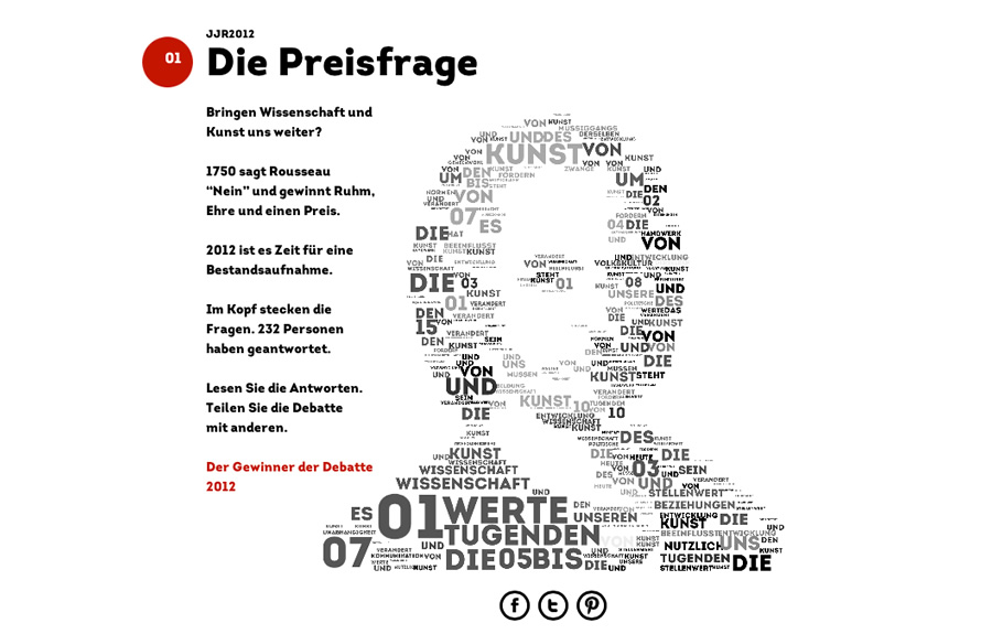
#4 – JJR2012
One of the stunning display of typography in a 3D format. Beautifully striking and mesmerizing to the viewer/ reader. The good thing about this site is that it plays around with typography to make it more interactive and engaging for the user.
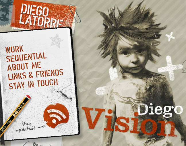
#5 – Diego Latorre
The site is well-balanced with a combination of typographies which give a feel of hand written and typed text. Typography carries the artist’s style of work – splash of colors and right into the viewer’s eye. Amazingly placed text and graphics make for an appealing and easy read.
#6 – Team Fanny Pack
A strikingly functional and very attractive typographic usage. The web-page breathes a life of its own. It’s stylishly professional and welcoming to the readers. The typography simply takes you to a fairy-tale world in subtle way than you can imagine.
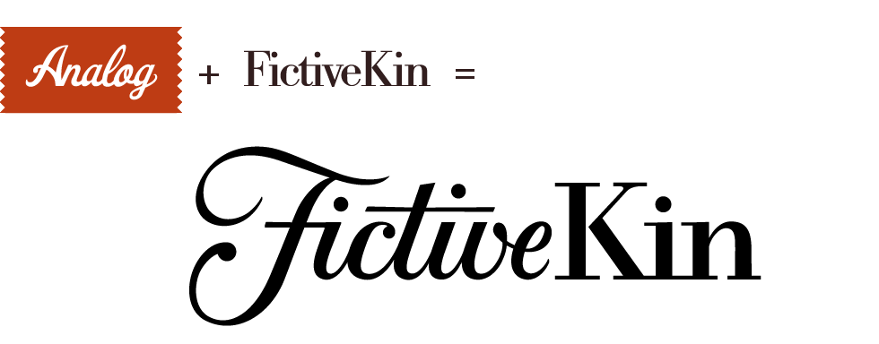
#7 – Analog
Comparatively smaller typography yet very effective to illustrate the purpose of the site. Slightly compact but great for rendering a good responsive experience to the user(s). It has been used to correctly match the tone and character of information thus molding well to the site’s appeal.
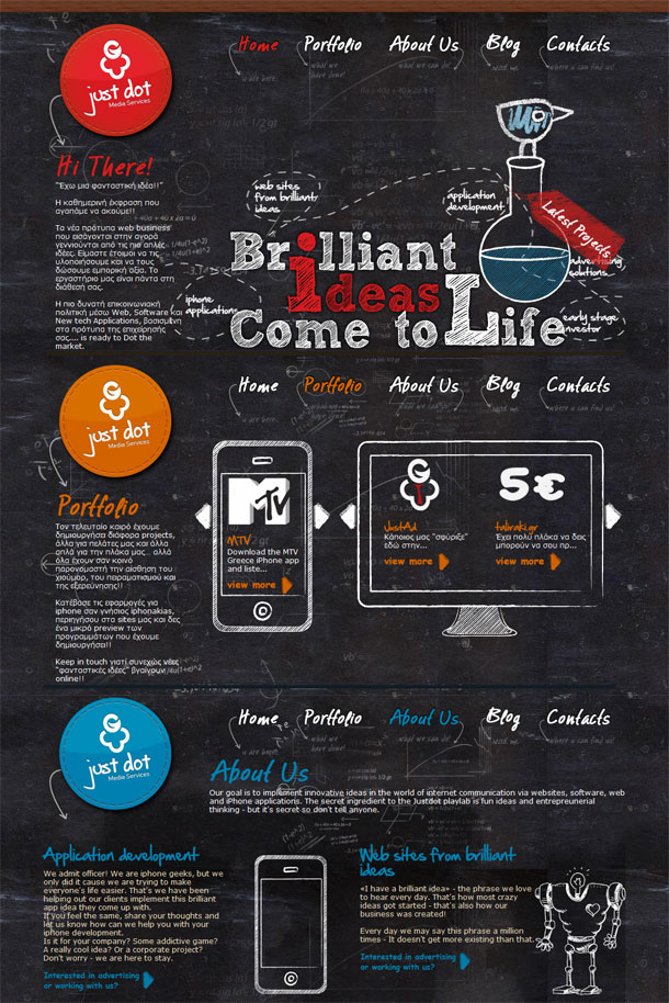
#8 – Just Dot
Playful yet easy-to-read typography which transforms one to a different land in a fun way. I simply love the background with geometrical signs. It truly stands up to its image – websites from brilliant ideas. The site fuels a young and kinetic imagination.
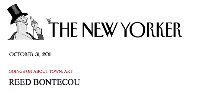
#9 – The New Yorker
Chirpy typography in the titles makes them appear quite outstanding. The overall look of the site bends more towards its historic charm. Nevertheless, the typographic variations give it a modern outlook as well.
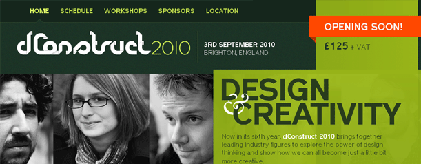
#10 – dConstruct
Neatly organized one of the best example I found of using typography to show content structure. The font has not been played around much but used mostly to highlight important facts or people. Not a unique but seriously an effective way of styling content.
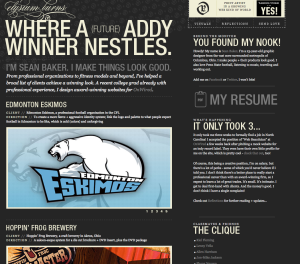
#11 – Elysium Burns
Delicate yet robust typography giving rise to a gamut of emotions in the reader/viewer. The site showcases commands great respect an attention due to the wise use of typographic variations. The website rightly fulfills its mission
of mixing perfection and emotions.
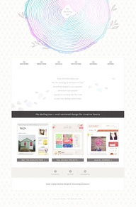
#12 – The Darling Tree
The typography sets the mood of the whole site. It creates a seamless flow merging content and ideas taking readers into the mind of the writer. It has a quality of being pleasing, polite yet emotionally transformative in a strong way.
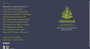
#13 – Elmwood
A great use of typography to make a lasting and memorable impression in the heart and mind of its users. Elmwood puts up a display of mature and consistent typography at its best. Every word appears very pleasing to the eye and senses.
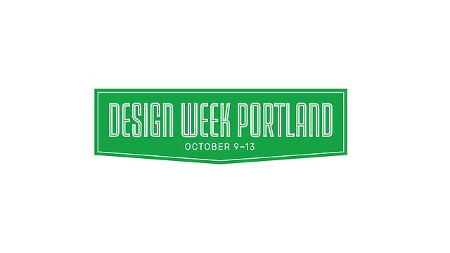
#14 – Design Week Portland
Its bold, in-your-face and really fun typography on this site. Use of this kind of typography shows a creative, smart and goal-driven mind of the business. Everything about it has a voice of its own giving it a very friendly feel and feel.
#15 – Squarespace
Use of dull-black color typography with dark-black bold fonts has always been a stand-out. The site exploits the power of colors and plain fonts to make its point. In my opinion it is a standard in itself as its very communicative in its overall appeal.
#16 – Pandora
I simply got addicted to the site after opening it for the first time. Superb use of typography to lure visitors and convert them to potential buyers. Site aesthetics are in complete union with its typography rendering it a nice pleasant appeal.
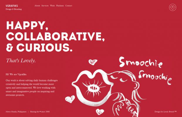
#17 – VGrafiks
Mix of large, small, and bold typography adds a lyrical charm to the written text. Typography brings out the background colors, making the experience highly engaging and entertaining, at the same time.
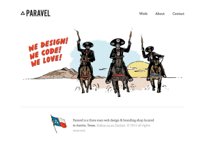
#18 – Paravel
Brilliant use of simple typography at its best. Since the site does not have much content the the typography is ‘just right’ to open the door of communication with the audience. Sometimes, less is more and the site imbibes just that into its use of typography.
#19 – Tapmates
Sensible use of typography to show variations in the type of content. Good use of space and subtle coloring of letters adds higher emphasis to the site’s core message.
#20 – Negative Labs
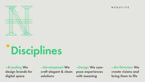
A display of very positive and motivating typography. The text is not only soothing to the eye but makes for an exciting read, too. Impressed by the linear and horizontal distribution of typography for bringing out the very best in the brand.
Last Words
Think of typography as a channel to reach the user’s conscious. Recently, web designers have created pools of typographic resources to convey specific meanings. Typography forms a vital aspect of every site’s content. When used properly, it fuses life into the written text and provokes a stream of emotions in the user. In my view, typography is one of the best form of setting the tone of the website.
Author Bio:
Skylar Barret is associated with PLAVEB – Web Design and Development Company, that also provides small business logo design services in Los Angeles. He loves to create intriguing website designs. During his free time you can find him with his two beautiful children enjoying video-games, from where he draws inspiration for his work.
