For some designers, typography has taken a back seat to the demands of responsive web design and trending minimalist interfaces. Don’t let the nuts and bolts of web design divert all your attention from type – it’s the only timeless element of what you do. The following 10 typography optimization tips will restore balance and integrity to your designs.
1. Resizable Typeface
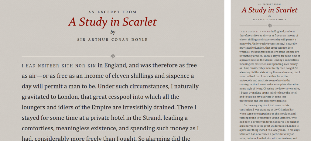
When specifying font size in your style sheet, make sure to account for varying screen sizes. Test your work on all the screens you can and get a feel for what sizes are not only readable, but also proportionally pleasing.
(Image by Information Architects)
2. Readable Line Length
Line length will have to adjust along with font size. There are plugins available to make your life easier, like Responsive Measure, but don’t get lazy. A different line length may call for some fine-tuning of line height, character spacing, and weight, as well.
(Image by Deborah Lyons using Responsive Measure)

3. Effective Contrast
Contrast is where the designer can express tone and meaning, greatly affecting the reader’s experience. Do not underestimate the importance and usefulness of contrasting colors, sizes, and weights.
(Image by Crazy Pixels)
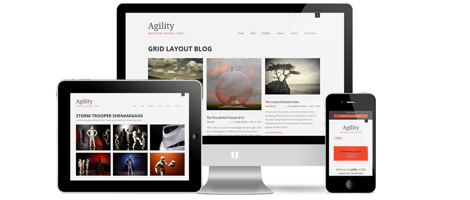
4. Responsive Column Width
Again, the text does not exist in a vacuum. Just like a well-framed painting, use varying column widths to enhance your type.
(Image by Agility)

5. Serif vs. Sans Serif
This is the most popular designer debate. Better or worse, right or wrong – it can only be determined in the context of your content and overall design. It is an important decision, however, and can help establish a serious or casual tone.
(Image by Hero Design)
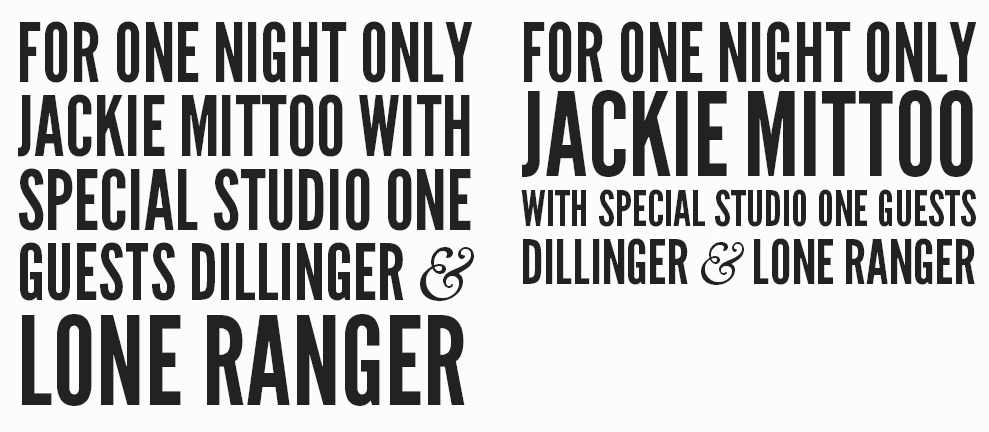
6. Distinguish Headings
The heading serves a different purpose than the body, right? So give it special treatment. SlabText is a great example of typeface that fully considers the unique needs and purposes of headings.
(Image by SlabText)
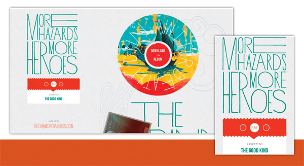
7. Consider Competing Devices
When you decide to do something bold, ornate, or high concept with your type, be sure to thoroughly test it on desktop, tablet, and mobile screens. You might need to showcase your work of art differently for each device.
(Image by Fine Citizens)
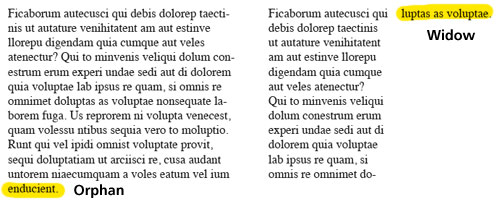
8. Mind Your Formatting
It’s the first lesson of layout, but it bears repeating. Watch out for widows and orphans; they’re especially pesky in the new world of responsive design.
(Image by Lena Shore)
9. Immerse Yourself in Fonts
Inspiration is everywhere. Pay attention to type design in daily life and note what works and what doesn’t; what moves you, and what merely distracts. There are more free fonts and hand-lettered typefaces at your fingertips than ever before, so spend some time appreciating (and using) others’ work, too.
(Image by Imgur)
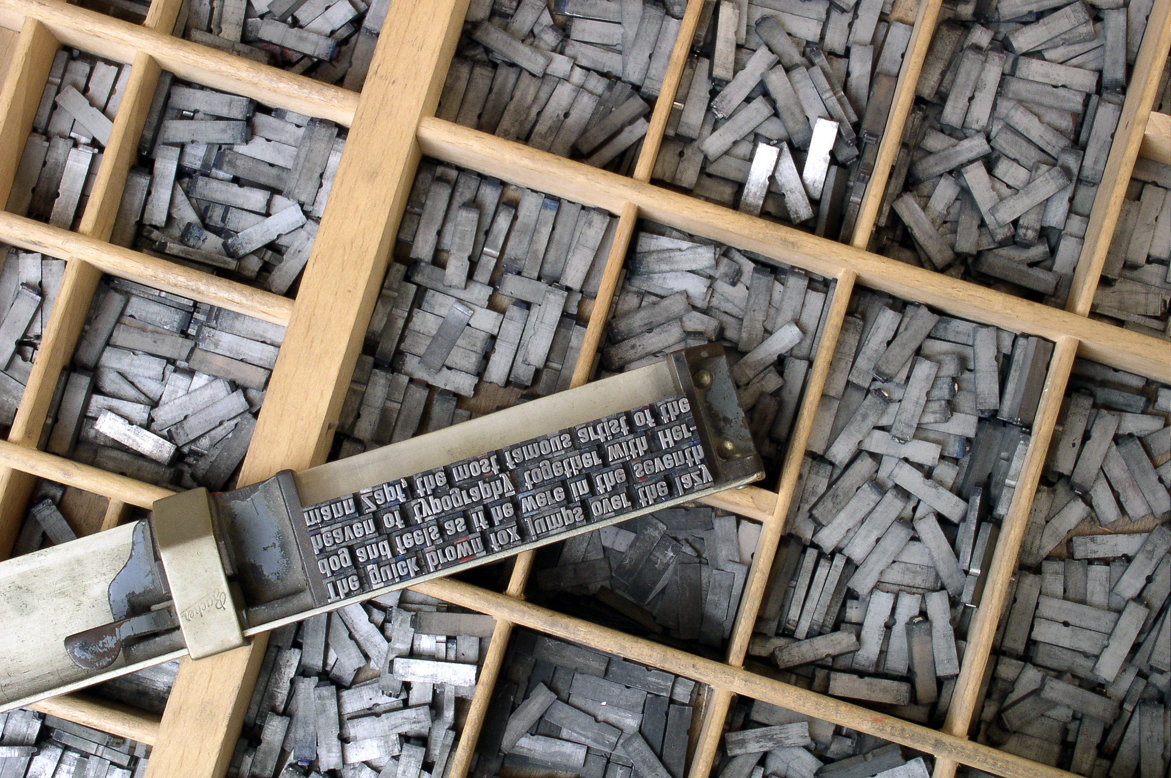
10. Know Your Type History
The more you know about the origins and evolution of type, the more passionate you will be about keeping it at the forefront of what you do. Learn why certain fonts are classics and the legacy of ascenders and serifs. You’ll impress curious clients.
Image: 10. History
(Image by galjot)
Author’s Bio: Brian Morris writes for the PsPrint Design & Printing Blog. PsPrint is an online commercial printing company. Follow PsPrint on Twitter @PsPrint and Facebook.
